Margaret & The Missed Pill
Lets go through how I Applied Design Thinking to Build a User-Friendly Health App for Seniors
This case study showcases my design process using the Design Thinking approach, with a focus on problem-solving and user experience, not the full scope of the health app.
“The Spark“ Where It All Began
I imagined someone like Margaret a 62-year-old woman living alone, juggling prescriptions, doctor visits, and her blood pressure readings. That moment sparked a mission, to design an app that would support seniors in managing their health, confidently and independently.
I wake up early like always, but I’m not sure if I took my blood pressure pill. I check my notebook, but it’s full of messy notes. I can’t tell if I wrote it down today or yesterday. I don’t want to take it twice or miss it, so I wait, hoping I’ll remember.
In the afternoon, I have a doctor’s appointment, but I can’t remember if it’s at 1 or 2 PM. I call my daughter. “It’s at 2 PM, remember?” she says kindly. I feel bad for forgetting again. I used to remember everything.
After dinner, I check my blood pressure 140/85. I don’t know if that’s better or worse than last time. My diary is full of messy numbers, and it’s hard to track any progress.
As I get ready for bed, I think about how much I rely on others and how confusing it is to manage my health. I just want something simple to track my pills, appointments, and blood pressure easily. That would help me feel more in control and less stressed.
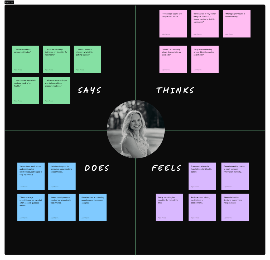
Empathy & Affinity Mapping
Walking in Margaret’s Shoes
To better understand the challenges senior citizens face, I created a realistic scenario centered around Margaret, a 62-year-old woman managing multiple medications and health appointments. By stepping into her world, I was able to grasp her daily struggles, habits, and emotional responses.
Using this scenario, I developed an Empathy Map to explore what Margaret thinks, says, does, and feels. This helped me uncover deeper insights into her pain points
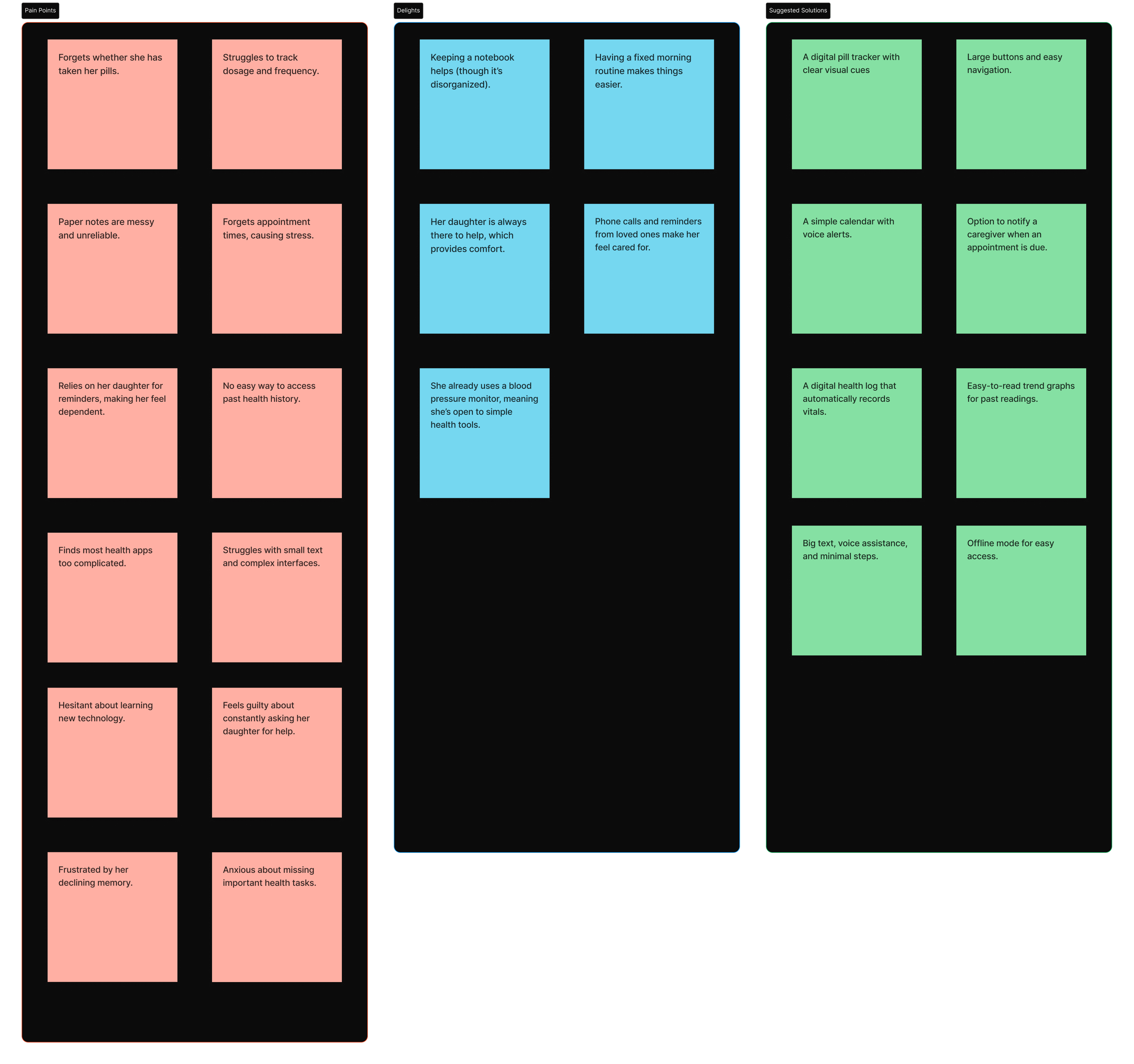
Painpoints, Delights & Suggestions
Defining the Problem
“Margaret, a 65-year-old woman, needs an easy way to track and take her daily medications because she often forgets or gets overwhelmed with complex app interfaces.”
From affinity diagrams and empathy maps, I gathered a set of recurring themes
Difficulty remembering medications
Anxiety around missed appointments
Dependence on caregivers for tracking vitals and history
Trouble navigating complex interfaces
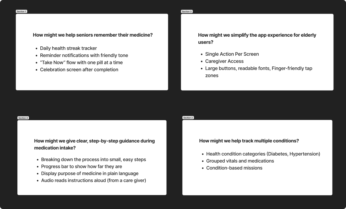
HMW Questions
Tackling How Might We Questions
After clearly defining the problem through user insights and empathy mapping, I transitioned into the ideation phase by generating How Might We (HMW) questions. These questions helped reframe the user problems into opportunity areas for design.
Margaret often forgets her medicine
How might we help seniors remember to take their medication easily?
She finds apps too complex
How might we simplify the app experience for elderly users?
She needs reassurance she's taken the right pill
How might we give clear, step-by-step guidance during medication intake?
She's scared of missing health appointments
How might we help seniors keep track of upcoming check-ups and reminders?
She’s overwhelmed by managing multiple medications and vitals
How might we break down health management into simpler, more manageable steps?
I entered the Ideation phase
After framing the key pain points as How Might We questions, I entered the Ideation phase. With the How Might We questions in hand, I shifted gears to explore solutions. This was my chance to think big and bold but always with Margaret in mind. For this case study, I’ve jotted down features, and focused on making things feel simple, clear, and comforting and highlighted a few key solutions that best demonstrate how thoughtful design can simplify and empower Margaret’s daily health routine.
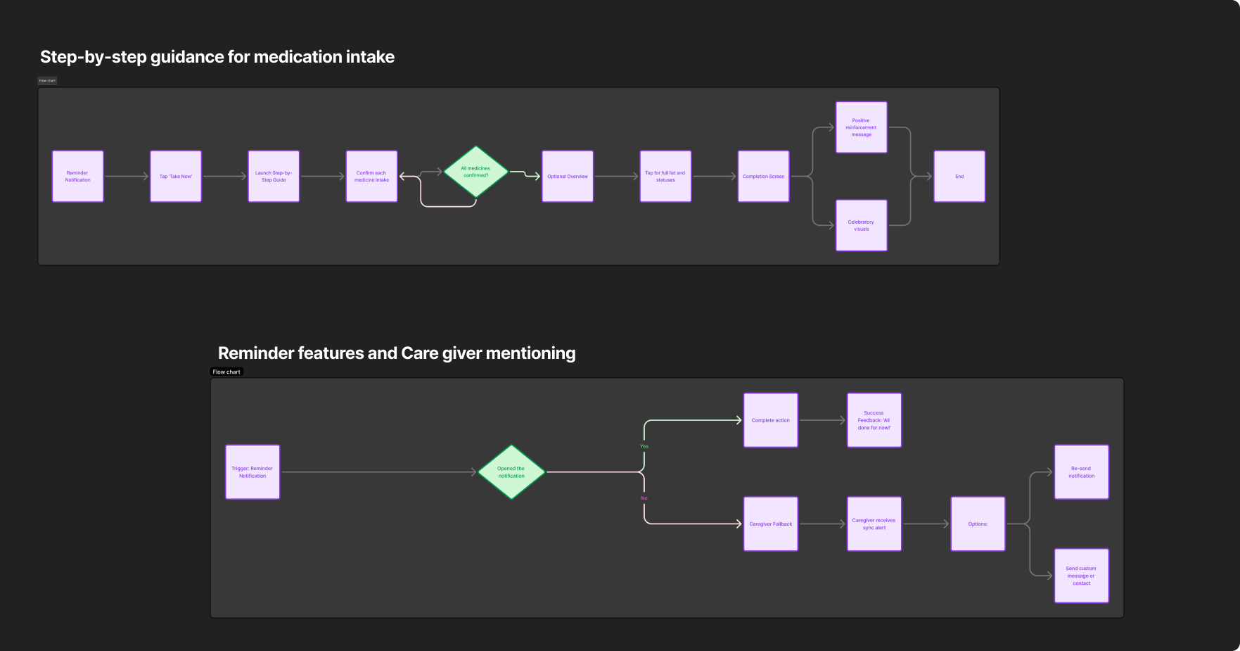
Streamlining User Journeys
After exploring a variety of creative ideas through ideation, I began prioritizing the most impactful and user-friendly ones, especially those that resonated with Margaret’s needs. With clarity on what to build, I translated these concepts into simple, intuitive user flows. These flows helped shape the app’s structure and ensured every touchpoint was tailored to seniors like Margaret
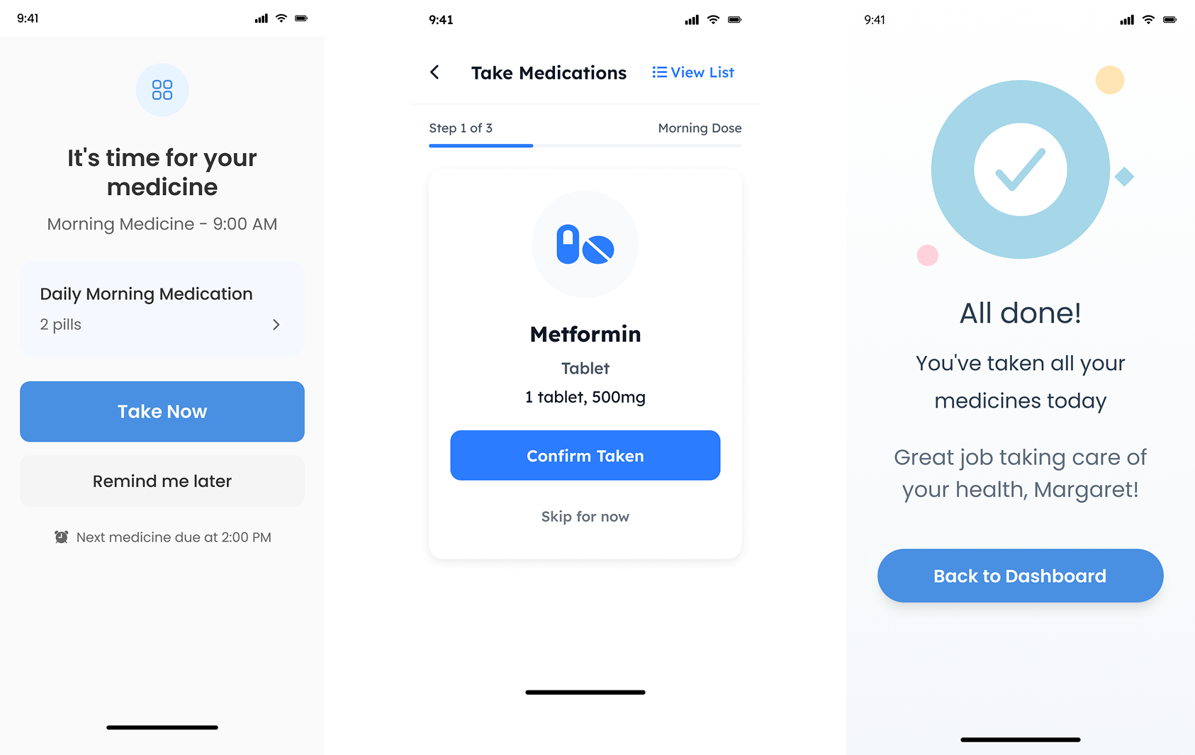
Low fidelity Wireframing
With the user flows finalized and priorities clear, I moved into the low-fidelity wireframing phase. My goal was to visualize the core interactions without getting distracted by visual details. These wireframes helped me map out the layout, structure, and flow of the appInstead of designing everything, I focused on illustrating a few key screens that best demonstrate how seniors can be empowered to manage their health confidently through clarity, encouragement, and ease.
Step-by-step guidance for medication intake
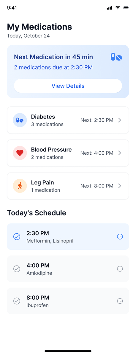
Clearly Categorized by Condition
Now Margaret can easily find her medications, organized by health conditions like Diabetes or Blood Pressure — no more guessing which pill is for what!
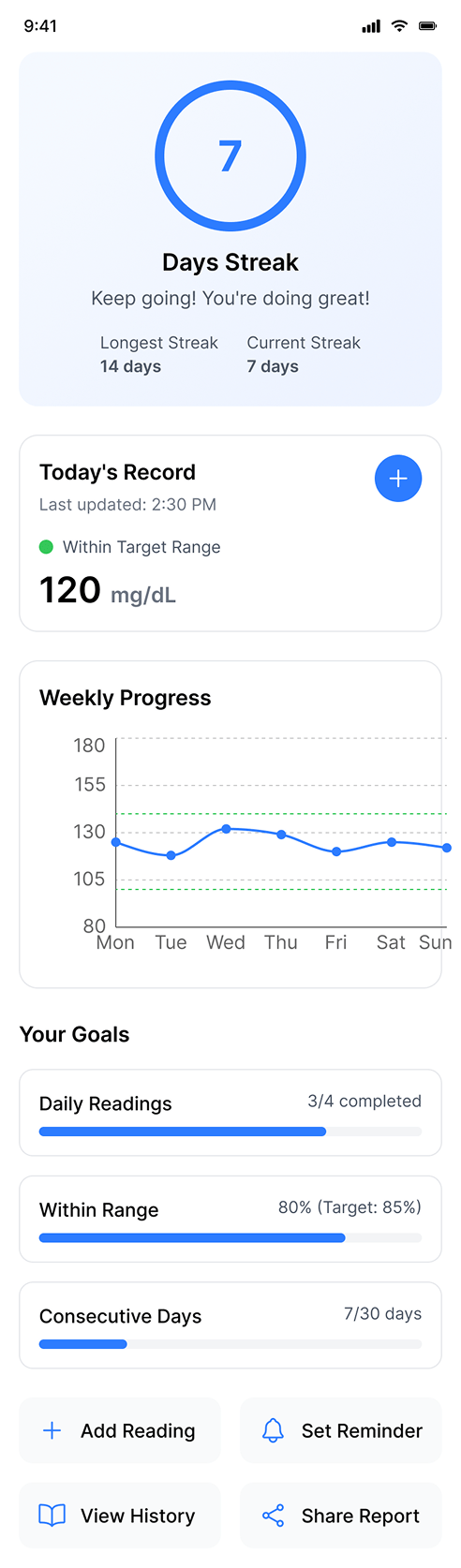
Daily Streaks That Motivate Healthy Habits
Now Margaret can easily see her progress, tracking her daily streak for checking blood sugar helps her stay motivated and feel in control of her health!
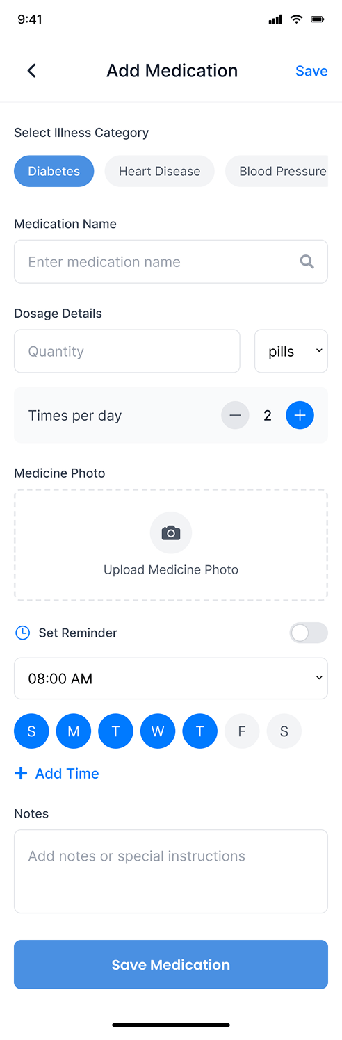
Easy Medication Entry for Margaret and Her Caregiver
Adding new medications is now simple. Margaret or her caregiver can quickly enter all the details, from dosage to reminders, in just a few taps.
From Wireframes to Final Design
Designing this health app was about more than screens it was about understanding real people like Margaret. Through the design thinking process, I created solutions that are both functional and empathetic.
This case study reflects how I work with curiosity, empathy, and a clear process, from research to wireframes. While only part of the app is shown, it highlights my ability to turn insights into thoughtful, user-centered design.
Lessons Learned & Key Takeaways
Empathy is Everything
Understanding Margaret’s struggles reminded me that good design starts with empathy. Walking in her shoes helped uncover real pain points that go beyond just screens and buttons.
Design Thinking Brings Clarity
Following the design thinking process kept the project focused and human-centered. From defining the problem to iterating solutions, it helped guide decisions with purpose and intention.
Gamification Can Motivate
Incorporating progress tracking and missions like a daily streak made health management feel less like a chore and more like an encouraging journey something I’ll use in future projects too.