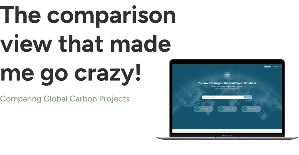
Project Overview
In this design sprint, I focused on creating a comparison view for users to explore and compare the world’s largest carbon projects. The tool allows users to select and analyze various carbon initiatives from around the globe, providing key metrics and data points for informed decision-making
Goal
Design a user-friendly comparison view for global carbon projects, allowing users to easily select and analyze key metrics from various initiatives to support informed decision-making and enhance environmental impact.
The Requirement
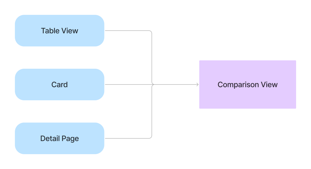
Before diving into the design, the client envisioned a powerful comparison tool for global carbon projects. They wanted users to seamlessly add projects from three different views: a table, a card, and a detailed page. The challenge was to integrate these diverse entry points while ensuring that users could effortlessly select and compare up to three projects at a time.
Ready, Get, Set, GO!
Research & Discovery
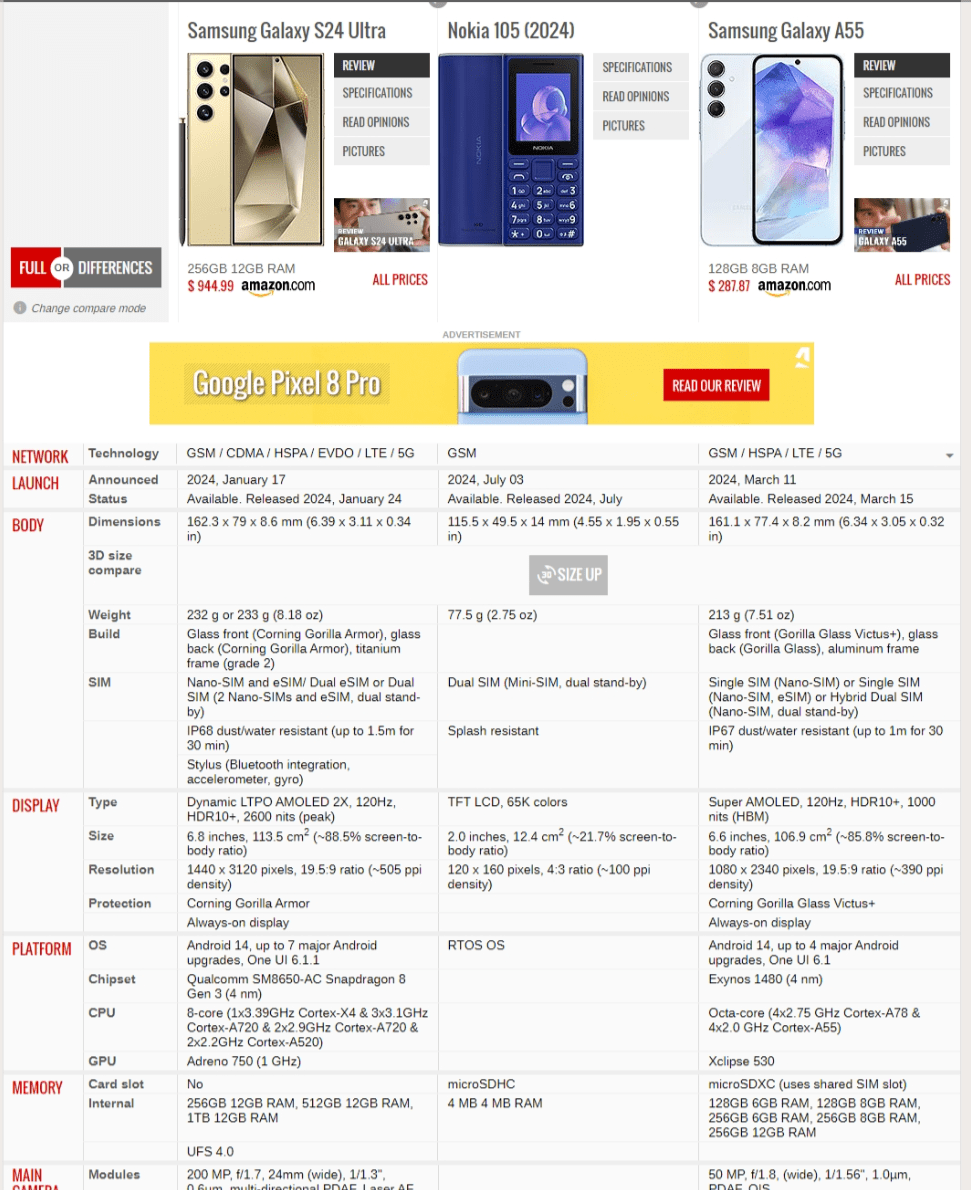
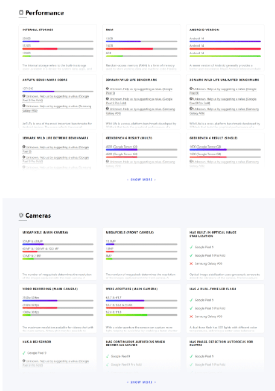
I started with what seemed like a straightforward task: researching comparison sites to get a grip on the best practices.
[Source : GSM Arena / Versus]
The Challenge

Tired of Scrolling? EXACTLY! That was my concern too!
I dove into the project details, and I realized there were over five sections, each packed with a ton of information. Panic set in as I thought, “How on earth am I going to compare all this on one page?” The idea of users having to scroll endlessly down a never-ending page drove me nuts!
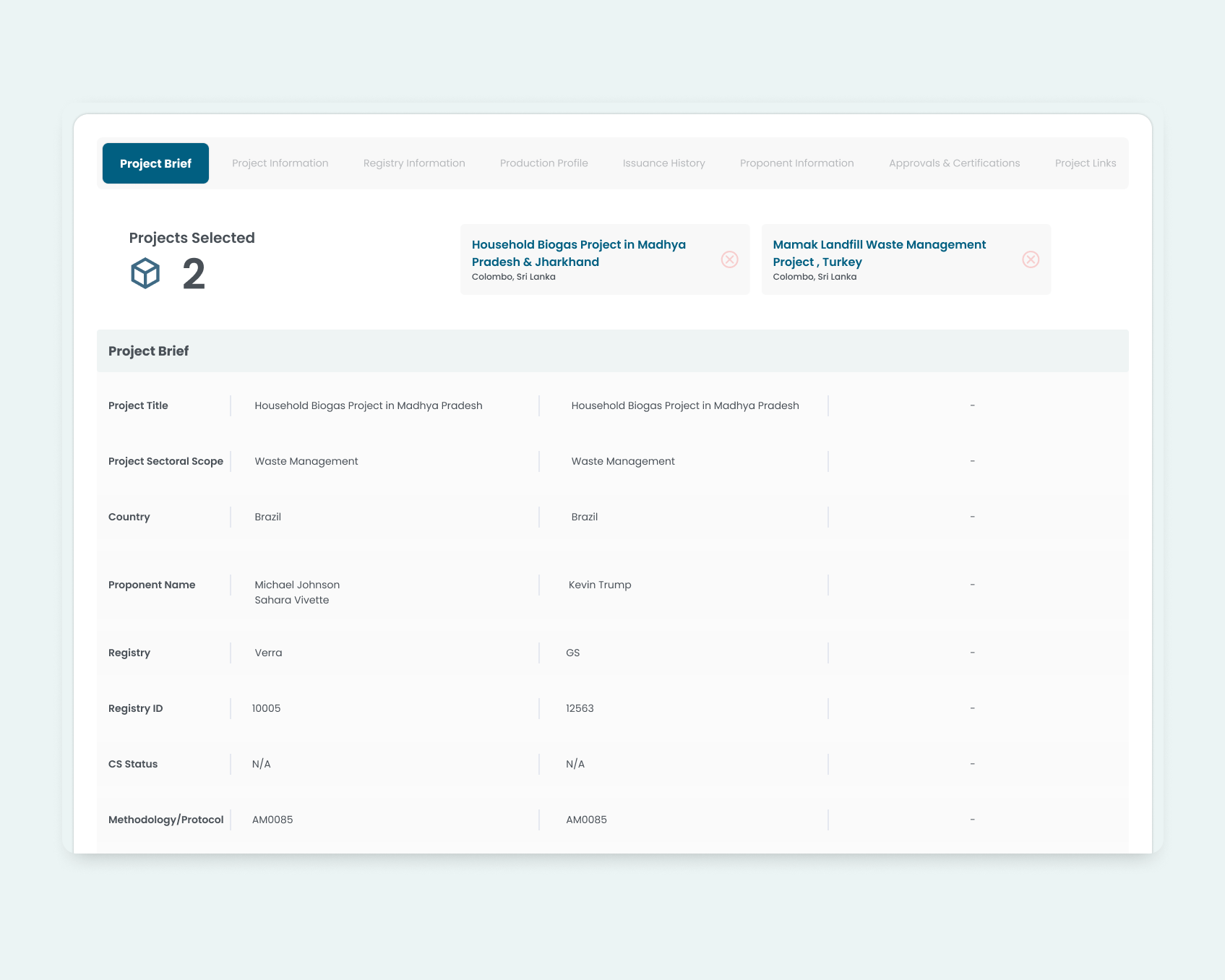
That’s when I knew I had to get creative. The solution? I decided to implement a wizard on top of the comparison table. This wizard would segment the extensive details into manageable sections. Instead of overwhelming users with one long, scroll-heavy page, the wizard allowed users to click on tabs to view each section of details in a single, focused table. This way, users could easily navigate between different sets of information without having to scroll endlessly, making the comparison process far more efficient and user-friendly
BUT!
However, the client initially wanted to present all the details on one page—yes, the dreaded long page. I knew that would be a challenge for users, so I thought, what if I could implement the wizard without switching tables? Instead, I could use it to jump directly to specific sections within the same page. This way, users could navigate the long page effortlessly, jumping to the exact information they needed without the hassle of endless scrolling. We proposed this solution to the client, and they loved to it.
Green Light from Developers?
I checked with the developers, The Sticky Wizard Gets the Go-Ahead.. Hooray!!!. We made the wizard sticky at the top, so users could access it no matter how far they scrolled. This way, navigating the long page stayed easy and intuitive, letting users jump to sections without the hassle of endless scrolling.

Result
The clients loved the solution. The sticky wizard made navigating the extensive information much easier, and the cart-like feature for adding projects streamlined their workflow, making their work more efficient
NEXT
Woof Application
The Woof App is an easy-to-use platform that helps pet owners and enthusiasts connect.
